MyFridgeFood, App Redesign
2025
SKILLS
UX Research, UI Design, Prototyping
This was a self initiated project, undertaken during my time on the UXTree Mentorship programme in 2025.
The programme requires participants to identify a user problem in a product or service and redesign one user flow.
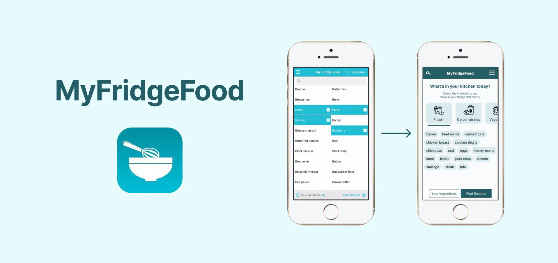
For my project I chose to redesign a recipe app I’ve used in the past. MyFridgeFood is an app that helps you find recipes using ingredients you have in your fridge/pantry. The app aims to reduce food waste and show people the possibility of what they can cook with few ingredients.
AWARDS /MENTIONS
Best Prototype, UX Tree Mentorship Course, 2025
Original screens
Prototype
Problem Statement
How can we encourage people to cook at home more and reduce food waste?
FigJam board with research
Research
Research Methodologies:
I choose to conduct qualitative and quantitive research to gain a better understanding of the problems associated with current recipe apps and attitudes towards cooking.
Target Audience:
Young adults 18 - 35
working proffessionals/ students looking to improve their home cooking skills
people who struggle to think of new recipes to cook
living alone or in share houses
Personas
Data Collection
To get a better understanding of peoples attitudes towards cooking at home, I conducted a multiple choice survey that was shared on my social media. I got a total of 41 responses which gave me great insight into my target users attitude towards cooking.
I conducted competitor analysis, analysing app store reviews of similar apps and reading online forums to see what people liked and disliked about these apps.
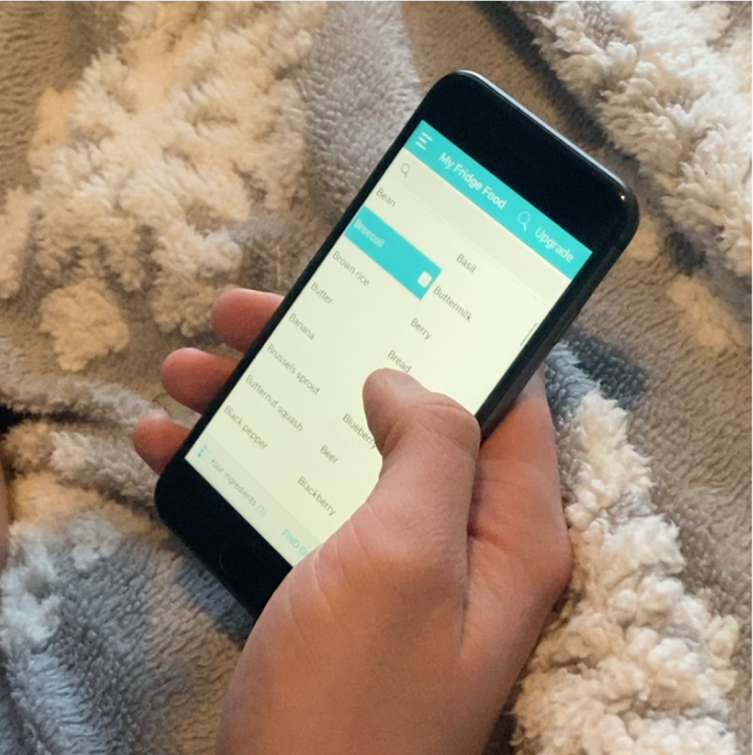
I also conducted usability testing with the existing app with 3 users.
Results from survey
User Testing
Key insights
01
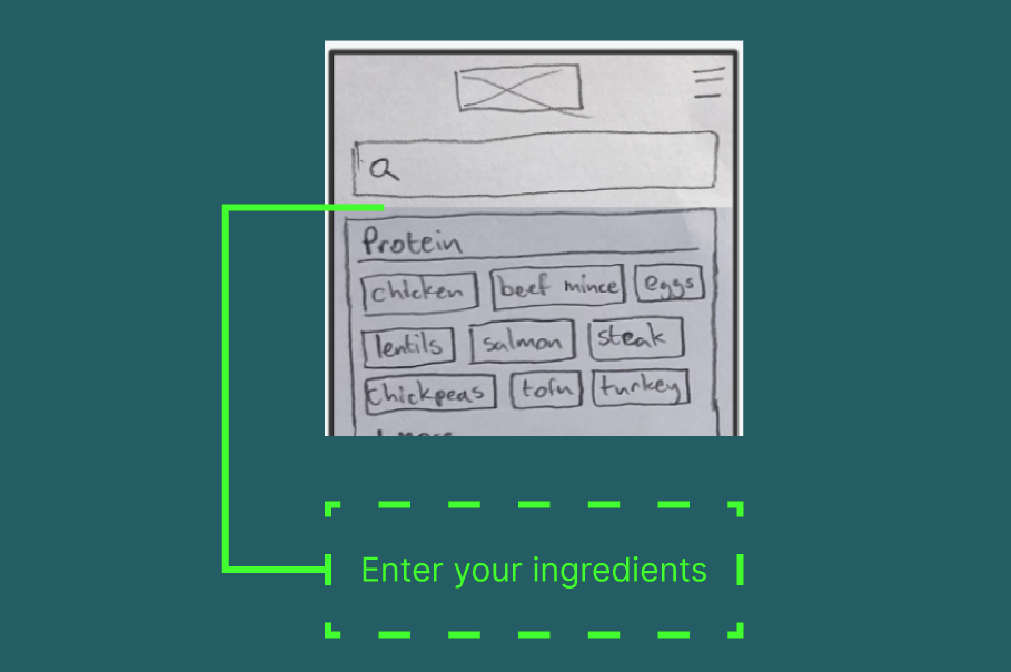
People get frustrated manually entering every ingredient
“Manually adding ingredients always makes me avoid using the app”
02
Most users like a variety of different dinners throughout the week
44% of people surveyed said they want to eat a different dish every night for dinner.
03
Users want more filtering options when picking a recipe
“I don’t like that there’s no filter to choose what meal I’m making“
Brainstorming/ Ideation
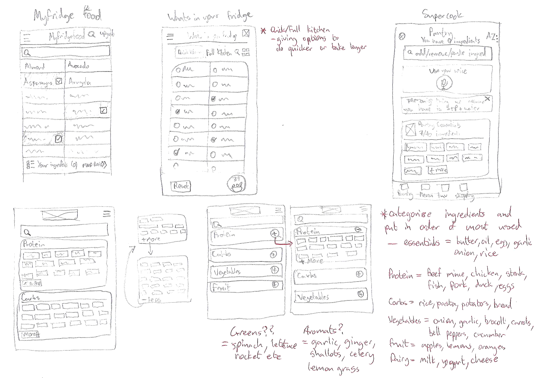
Once the research was done, I began brainstorming ideas on how we can improve the current user flow of the MyFridgeFood app. I did this by mapping out the current user flow and sketching possible solutions to improve it.
Sketches
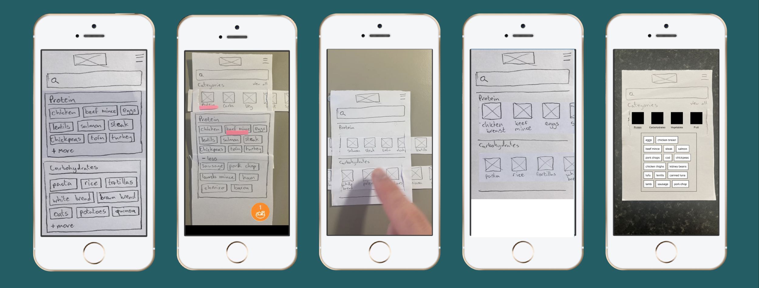
As I was ideating and sketching possible solutions, I would test each step with 2 users to get instant feedback.
My prototypes were a mix of paper and Figma to iterate quickly and get the product into user hands fast.
This approach allowed me to validate iterations in low-fidelity, allowing me to focus the user problem not how the app looked.
Low-fidelity prototypes
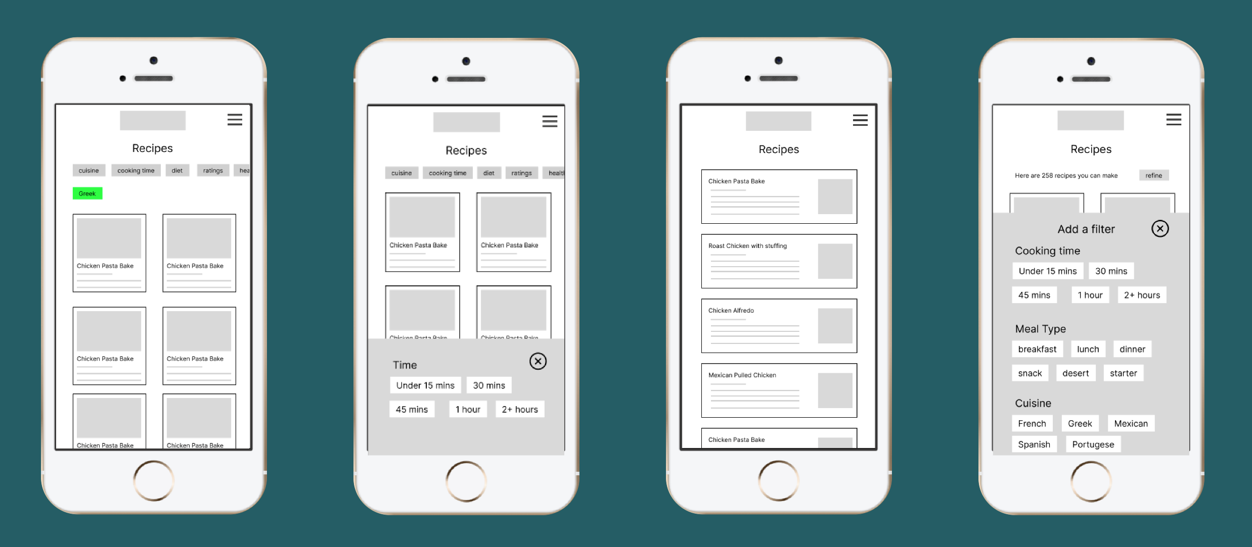
Medium-fidelity prototypes
User Feedback
Users would like some direction when first
opening the app
“I’d like some prompts to explain what to do?“
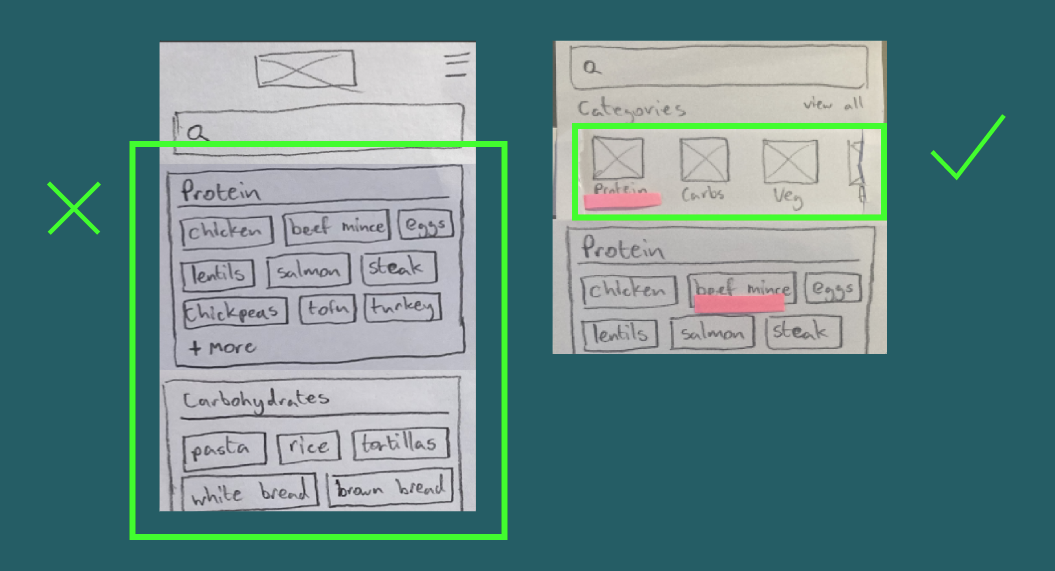
Scrolling across for categories was preferred
over scrolling down
“I prefer to scroll across than scroll down when changing categories“
Users assumed ingredients would be in alphabetical order
“I thought bacon would be beside beef mince?“
User Feedback
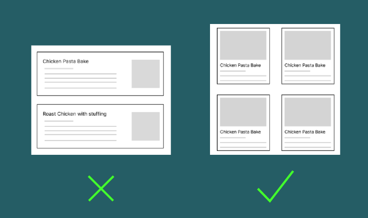
Grid view was preferred over list view for recipes
“It’s easier to see the images here because they are bigger“
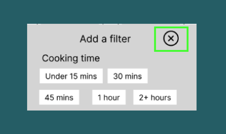
User looked for ‘return’ button to get back to recipe list instead of ‘x’.
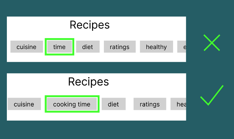
Certain languages didn’t make sense when applying filters.
“It should say ‘cooking time’ not just time“
Original ingredient page
New ingredient page
New recipe page
Original recipe page
Project Outcome
The redesigned app made the inputing of ingredients faster and more intuitive for users. The added filtering options allowed more flexibility for the users to narrow the search down and reduce cognitive load.
Improving these steps in the app makes it quicker and easier for users to find recipes they can make with the produce they have, reducing their food wastage and saving them money.
Reflections and Learnings
Test early and test often. Testing interactions with low fidelity paper prototypes allowed me to validate quicker.
Assumptions aren’t always correct and should be validated with user testing.
In future projects, I would conduct more usability tests with a bigger group of users.
